Themes, toolbar and shortcuts
Toolbar and actionbar
The toolbar holds the buttons you want at hand, and the actionbar a button per command with its key. Both are yours to change.
Right on the bars: right-click a toolbar button for Icon Only, Icon and Text, Remove from Toolbar, Hide Toolbar and Customize Toolbar…. The actionbar has Remove from Actionbar, Hide Actionbar and Customize Actionbar….
In Preferences ▸ Toolbar:
- Show the toolbar, and a preview of it as it will look.
- In the toolbar: the buttons in order. Drag a row by its handle to move it, choose Icon or Icon and text, and × takes it off.
- Separator adds a line between buttons, and Spacer sends the buttons after it to the right end (one spacer per toolbar).
- Not in the toolbar: every other command, by group, with a Filter. Add to toolbar puts it at the end, with its word.
Preferences ▸ Actionbar works the same, without separators and spacers. Each button shows the command’s function key if it has one, or its first key. Change a key in Shortcuts and the actionbar follows at once.
Buttons that don’t fit the window go under ⋯ at the end of the toolbar. Reset Toolbar to defaults and Reset Actionbar to defaults bring back what Commander started with.
Shortcuts
Preferences ▸ Shortcuts lists every command with its keys, grouped by where the key works: in a panel, in the viewer, in Compare Files, anywhere, and the fixed keys of each.
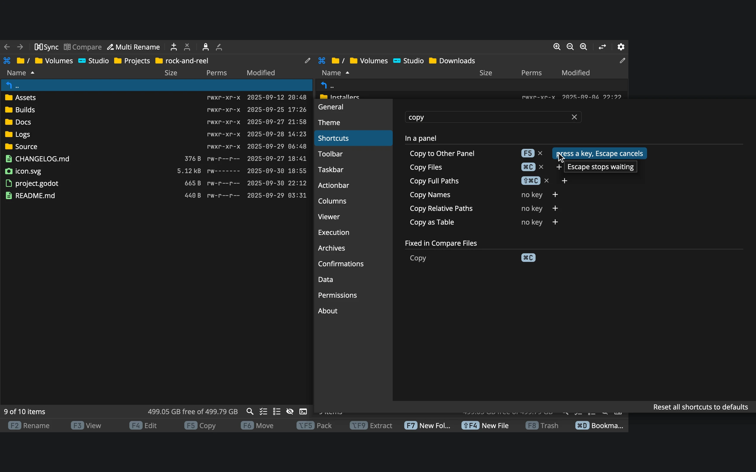 12345
- 1Filter: by the command or by the key: f5 finds F5
- 2Keys: × takes one off, + adds one
- 3Waiting for a key: press it, or Escape
- 4Fixed keys: part of the window, listed greyed
- 5Reset all shortcuts
- Add a key: click + after the keys, and press the combination. Esc cancels. A command can have two keys.
- Take a key off: the × beside it. A command can have no key at all.
- Back to the shipped key: Reset on a row you changed, or Reset all shortcuts to defaults at the bottom.
- Find a command by typing its name or its key into the filter.
A key that is already used is refused, never taken over. The row says which command already runs it, and keeps waiting for another key. To move a key, take it off the other command first. The same key can work in two places at once, such as F3 for View in a panel and for closing the viewer, as long as the places don’t overlap.
Fixed keys, such as Enter to open and the arrows to move, are part of the window and can’t be changed. They are listed greyed, so you know they are taken.
On a Mac, the keys Commander ships with follow your keyboard layout, as macOS menus do: on a Czech layout, ⌘0 is ⌘é. Keys you set yourself never move.
Your changes are saved in shortcuts.properties, which holds only what differs from the shipped keys. The Shortcuts page lists the shipped keys, ready to print.
Themes
A theme is everything you see: the colours, the two fonts, the icons and the sizes. Commander comes with dark and light, and you can make as many of your own as you like.
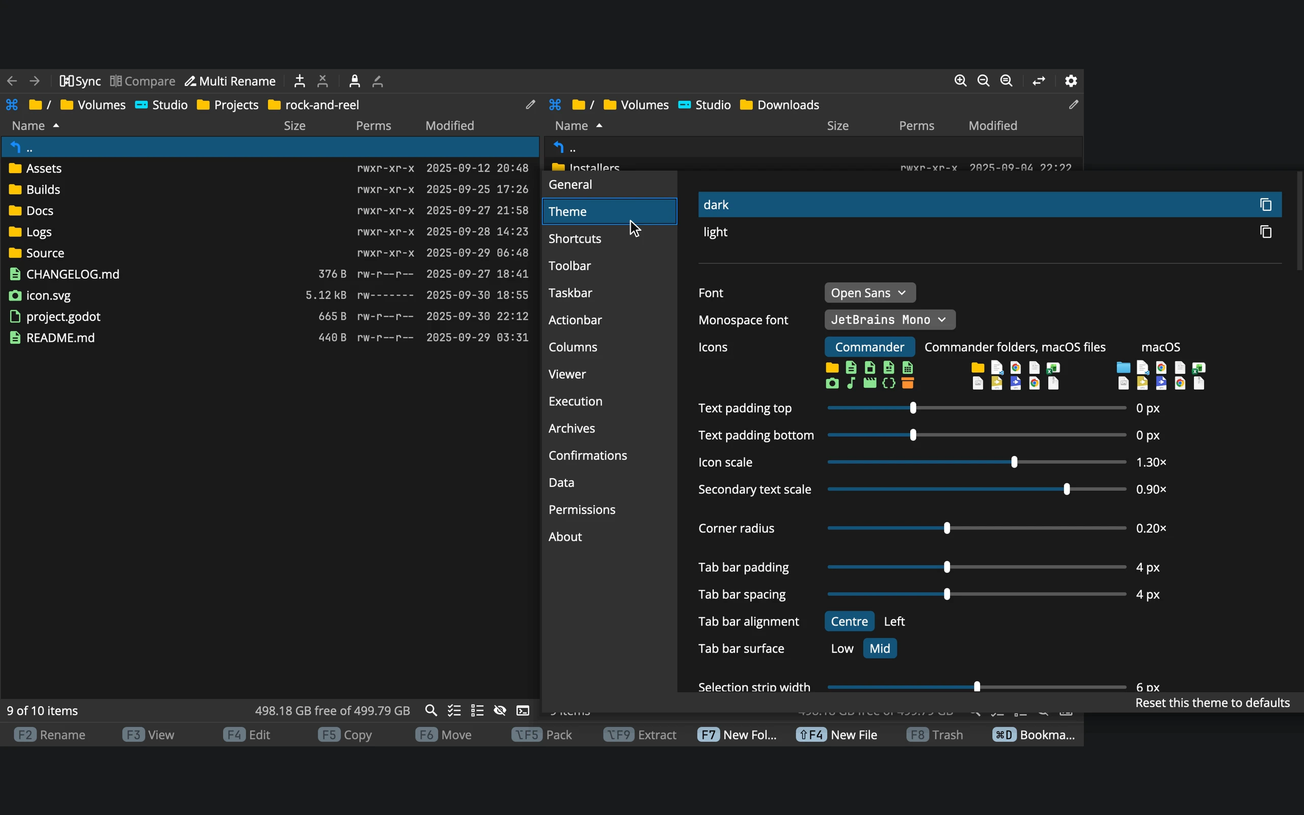 12345
- 1Themes: click one to switch; duplicate, rename, delete
- 2Fonts: the theme's own or any on your system
- 3Icons: Commander's, the system's, or both
- 4Sizes: padding, scales, corners, the tab bar
- 5Reset this theme: back to the theme it came from
- Switch by clicking a theme. Everything changes at once, icons included.
- Make your own with the copy button beside a theme: it duplicates it, fonts and icons included, switches to the copy and lets you type its name. dark and light themselves can’t be renamed or deleted, so you start from a copy of one of them.
- Every change shows as you make it, in every window, and is saved in the theme.
Below the list:
- Font and Monospace font: from the theme’s own font files, or any font on your system. The monospace one has to be monospaced.
- Icons: Commander’s for everything, Commander’s folders with the system’s file icons, or the system’s for everything.
- Text padding top and bottom: the room above and below the text of every row, from tight to roomy. See Density.
- Icon scale, Secondary text scale, Corner radius, the tab bar’s padding, spacing, alignment and surface, the width of the selection strip, and how faint hidden items are.
Colours
Under the sizes, every colour of the interface is listed by its group: Surface, Text, Item, Indicator, Shortcut, Progress, Compare Files, Syntax and Status. Each row shows the colour, its name and its value. Click one for a colour picker, a field for its value, a sentence saying where it is used, and Back to default. A colour the theme doesn’t set is marked derived: it follows from the others.
Reset this theme to defaults puts every colour, the fonts and the sizes back as they are in the theme this one came from: a copy of light goes back to light.
Themes on disk
Each theme is a folder in Commander’s settings, ~/.cuberact/commander/theme/<name>/ (%APPDATA%\Cuberact\Commander\theme\<name>\ on Windows), with three things in it:
- theme.properties: the theme in plain text, one
key = valueline each,#rrggbbcolours. Keys it doesn’t set take their default. - fonts/: drop
.ttfor.otffiles here and they appear at the top of the font menus. - icons/: an SVG named like a built-in icon, such as
folder.svg, replaces that icon. Icons are drawn in one colour, the theme’s, so the colours inside the SVG don’t matter, only its shape.
To share a theme, copy its folder; on another computer, put it in the same place. A new version of Commander never overwrites a theme on your disk, dark and light included.
Commander doesn’t follow the system’s light or dark mode by itself: the theme you choose stays.
Zoom
Zoom makes everything bigger or smaller together: text, icons, rows, toolbars, dialogs, the viewer and Compare Files.
| Command | Mac | Windows | Linux |
|---|---|---|---|
| Zoom In | ⌘= | Ctrl+= | Ctrl+= |
| Zoom Out | ⌘- | Ctrl+- | Ctrl+- |
| Zoom In Finely | ⌃⌘= | Ctrl+Shift+= | Ctrl+Alt+= |
| Zoom Out Finely | ⌃⌘- | Ctrl+Shift+- | Ctrl+Alt+- |
| Zoom Reset | ⌘0 | Ctrl+0 | Ctrl+0 |
⌘ (Ctrl) with the wheel or the trackpad zooms too, finely with ⇧. Zoom goes from 0.20× to 3.00× and is remembered; Preferences ▸ General ▸ Zoom sets it with a slider.
Density
How tight the rows are is set by the theme’s Text padding top and Text padding bottom, from −2 to 5 pixels each. Every one-line thing in the app takes the same height, so lists, buttons, fields, menus and tabs change together and stay in line. The height also follows the fonts and the zoom.
With the Preview column shown, a picture’s row is as tall as its preview (Preferences ▸ Columns ▸ Preview size); the other rows keep their height.
Fonts in the panels
The theme has two fonts, a regular one and a monospaced one. Preferences ▸ Columns ▸ Font decides which of them the names use, and which the sizes and dates use: the regular font for names and the monospaced one for the rest, to start with.